Table of Contents
Using Lists
Lists are the basic container for controlling and organizing Units in XTension. The Master List is always available and will always display all your Units. You can open the Master List by selecting it from the Lists menu or using the Command-0 keyboard shortcut. You can create new lists by selecting the New List menu item from the File menu. You can create any number of Lists, each one must have a unique name.
The list can be sorted by clicking in the headers as is normal. You can also manually change the order of the units in the list by selecting and then dragging them up and down. After creating a new list you can drag units from any other list into it. You can also add units to a list by selecting them and control or right clicking on the selection then selecting “add selected units to list…” You can re-arrange the columns and resize them similar to how the Finder or any other OS app behaves.
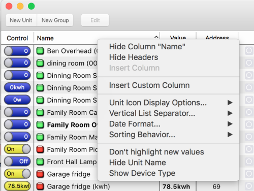
By performing a control or right click in the headers of the list you can perform quite a bit of other customization. Any column in the List can be hidden by control clicking on it and selecting to Hide it. You can also hide the headers entirely for the list. You can re-enable them by control clicking in the content area of the list and selecting to show headers there. If any columns have previously been hidden you’ll be given the option of re-showing them under the Insert Column menu item.
- Insert Custom Column You can insert a column to display the value of any Unit Property. Unit properties can be presented as text/numbers or as dates. They also support inline editing. Just click the custom column cell and you’ll be presented with either an edit field or a date edit panel if the property is a date. See Using Custom List Columns for more info. (Custom Columns were added in XTension version 9.4)
- Unit Icon Display Options: There are 4 options for displaying an icon or indicator to the left of the Unit name. The Jewel and Simple Icons are a basic indication of the On or Off state of a unit. The default is to draw a unit in the ON state, or with a non-zero value, with a red indicator and a unit with a 0 or OFF value with a green indicator. You can change the colors displayed for the unit states in these and all other indicators with the Custom Background Colors option in the Edit Unit Window - Display Tab
- Draw Jewel Icon is the default and what is shown in the example image above.
- Draw Simple Icon draws a simpler looking box of the Units background color without the complicated shading added to the Jewel.
- Draw Unit Icon if you have chosen a Unit Icon image for the Unit a small version of the Icon will be drawn in the list.
- No Icon no Icon or indicator will be drawn in the Name column of the List.
- Vertical List Separator You may or may not wish to draw vertical lines separating the columns in the List.
- None don’t draw any vertical column line.
- Dotted draws a subtler dotted line.
- Solid The default as shown in the above example, a solid line.
- Date Format Changes the format of the date in the Last Activity column.
- Relative The default, shows “Today” or “Yesterday” and the time of the event. If the Last Timestamp of the Unit is longer ago than yesterday then a regular system date formatted date is shown before the time.
- Time (with seconds) does not show the date but does include the seconds of the last timestamp in the date display.
- Time (without seconds) does not show the date or the seconds of the time.
- Date just the day the last activity happened on.
- Date/Time (with seconds) the full date and time are displayed.
- Date/Time (without seconds) the date and the time without the seconds.
- Sorting Behavior Controls how the list is sorted or auto-sorted.
- None if you have dragged units around to re-order them then this will be the selection.
- Normal if you have sorted the list by one of the columns this will be the selection.
- Auto if you have a column selected and the sorting behavior is Auto then the list will resort if any value displayed in the sorted column updates. For example if you’re sorted by last activity and a unit receives a new value the list window will resort to show the most recently updated units at the top or the bottom. If you are sorted by value then whenever a unit receives a new value it will resort based on the new values.
- Highlight/Don’t Highlight New Values By default the lists will draw a yellow highlight on a unit and then fade it out a few seconds later to indicate that unit was controlled or that it received a new value. This can be quite useful but if you’re controlling the machine via a slow VNC link it can cause delays as more traffic is generated to update the display. You can disable this feature by selecting “Don’t Highlight new Values” for individual lists and re-enable it by selection “Highlight New Values”. Additionally the fade out animation is suppressed by selecting the “reduce transparency” option in the Preferences Window
- Show/Hide Unit Names Just as you can disable the display of the Unit Icon or Indicator in the Name column, you could also display only the Icon or indicator by hiding the display of the unit name.
- Show/Hide Device Type In the Address column the device type is drawn after the address. You can turn this on or off by choosing this Menu Item.
- Zoom Controls The lists can be zoomed in and out for a larger display via these menu items or via the Increase/Decrease Size menu items in the View menu. The keyboard shortcuts for zooming are command and the + or - keys. The Reset Zoom selection from either place returns the window to a zoom of 1.0.
- Show/Hide the Toolbar You can hide the Toolbar of the window via the Show/Hide menu item of the View menu.
- Show/Hide the Headers You can also hide the headers of the List completely via the Show/Hide the Headers menu item of the View menu for an even more compact look to the window.
Resetting The List
If at any time you get columns resized to invisibility or can’t reach other settings because of dragging a column size so far off the window you can reset a list window to it’s default settings by holding the option key as you open the List from the List menu.
Controlling Units
Use the Control column to toggle or control a unit. Double clicking on the unit in the list will also toggle the units state. Clicking the Value column or the unit state indicator jewel will bring up the Detailed Unit Controls with more options for uint controls including time frame settings. See the Controlling Units From Lists article for more info.
You can also send an ON/OFF command for unit from the Contextual menu. Control or right click on a Unit and select “Turn ON” or “Turn OFF”.
Editing Units
You can jump directly to the selected units Edit Window by pressing the right arrow key, selecting “Edit” from the Contextual menu or using the Command-I “get info” menu short cut.
The Unit List Contextual Menu
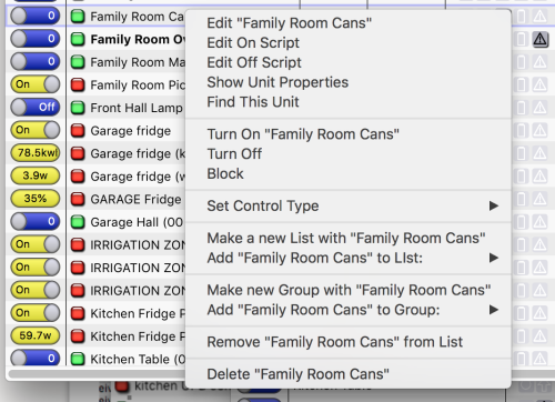
Control or right clicking on a Unit brings up the Unit contextual menu:
- Show Headers if you’ve previously hidden the headers of the List then the first item in the contextual menu will let you show them again. If you haven’t hidden the headers this menu item will not be visible.
- Edit opens the Edit Window for this Unit.
- Edit On Script and Edit Off Script jumps right to editing the ON or OFF script for the Unit.
- Show Unit Properties opens the Unit Property display for the Unit.
- Find This Unit will open the Find dialog and being a search through all scripts and objects for any that reference this unit name.
- Turn On and Turn Off will send an on or an off to the selected Unit.
- Block or UnBlock blocks or unblocks the Unit.
- Set Control Type lets you change the type of control presented for this unit in the Controls column. This is just a shortcut to the same value that you can edit in the Edit Unit dialogs “Display” tab. Current choices are: Toggle, Buttons, Text Field, Popup Menu and None.
- Make New List With Selection You can create a new list and automatically include the selected Units from this list.
- Add Units to List… Offers a sub-menu of the other lists so you can add the currently selected units to one.
- Make New Group With Selection Creates a new Group with the selected units.
- Add Units to group… Offers a sub-menu of already existing Groups so you can add the currently selected units to one.
- Remove Unit From List if the list is not the Master List as in the example there will be another option to remove the unit from the list. If it’s the Master List being displayed you cannot remove a unit from it as all units are always displayed in the Master List.
- Delete Unit will ask you if you’re sure you really want to permanently delete the selected units.
Using the Flags Column
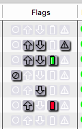
The Flags column of a List window displays some useful information and offers several shortcuts for editing.
The first flag shows whether the Unit is Blocked or not. Clicking on the icon toggles the blocked state of the unit.
The next 2 icons indicate if the Unit has an ON script or OFF script. Clicking on them will open the Edit Script window for the Unit if the script already exists, or create a new script if it does not exist yet.
The fourth icon displays the battery level of the device. If the device does not support sending a battery level then this icon will be greyed out.Depending on the device there will be different amounts of information here. For X10 security devices or Oregon temp sensors that include the low battery flag if their battery starts to get low there are only 2 states, all green or all red. For more modern devices like ZWave battery operated sensors that send a percentage value that will be reflected in the drawing of the green portion of the battery in order to graphically give some more information.
If you mouse over the battery display a tool tip will popup showing you the actual percentage of the battery remaining if applicable.
You can also get a list of units with the low battery flag set via the All Of Class Verb.
The last column indicates if there is an error set for the unit. Not all devices support sending errors but modern devices like ZWave or ZigBee devices do. If the unit is unreachable for some reason the warning triangle will display and the tool tip will be the text of the error from the controller as well as the date and time when the error was set.
Interface Column
The interface column shows the name of the Interface that the Unit is assigned to. It also shows a status indicator. If the interface is enabled and connected and appears to be operating normally the indicator will be green. If the interface is disabled the indicator will be grey. If the interface has been disconnected but has not yet exhausted it’s retries the indicator will be yellow. If the interface was not able to reconnect and has given up the color will be red.


